8 Code for data visualisation principles
In chapter 1, we introduced you to data visualisation principles. At the time, we hid the code behind creating the plots we used to demonstrate our points as you may not have used R before. For the group task in chapter 7, we want you to create a "good" and "bad" version of a plot, so we thought it would be a good idea to demonstrate the code we used in case you want to use it for your group task.
8.1 Y-axis truncation
If you want to shorten the y-axis, it is not the most intuitive of functions in ggplot. First, if we recreate the more honest version of the plot:
# Behind the scenes, we simulated some values for group A and group B and saved them in data
ggplot(data, aes(x = Group, y = DV)) +
  geom_bar(stat = "summary", fun.y = "mean") + #Normally not a good idea to calculate the mean for a bar plot, but for demonstration purposes
  scale_y_continuous(limits = c(0, 100), # Manually set the limits
                     breaks = seq(0, 100, 25))+ # from 0 to 100 in steps of 25
  theme_minimal()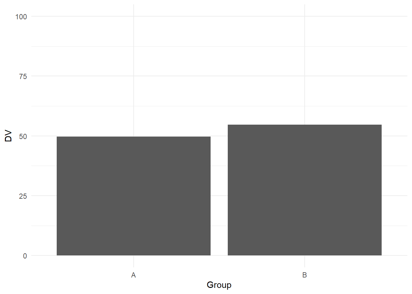
We know its normally not a good idea to summarise continuous data with the mean per bar, but see this as a demonstration perfect for the "bad" plot. If you want to shorten the y-axis, intuitively, you might think you could just shorten the limits:
# Behind the scenes, we simulated some values for group A and group B and saved them in data
ggplot(data, aes(x = Group, y = DV)) +
  geom_bar(stat = "summary", fun.y = "mean") + #Normally not a good idea to calculate the mean for a bar plot, but for demonstration purposes
  scale_y_continuous(limits = c(45, 60), # Manually set the limits
                     breaks = seq(45, 60, 5))+ # from 0 to 100 in steps of 25
  theme_minimal()
Your intuition would be wrong. Here, setting the limits will remove data outside of these limits, so you might find yourself with an empty plot as you removed so many data points.
To shorten the y-axis, we need an extra function called coord_cartesian (see the help page online for further details). In essence, this function allows you to zoom in on a part of the graph and it will no longer remove data points:
ggplot(data, aes(x = Group, y = DV)) +
  geom_bar(stat = "summary", fun.y = "mean") +
  coord_cartesian(ylim = c(45, 60))+
  theme_minimal()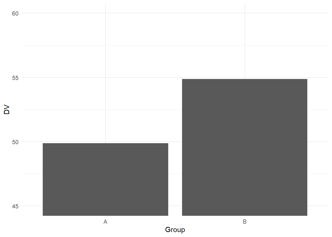
8.2 Colour-vision impairments
We already demonstrated how to change colours in chapter 3, but you might want to know how to manually select colours. There are different ways of selecting colours which you could use to create a nice colour-blind friendly plot for the "good" submission, or you could select the most garish colours imaginable for the "bad" submission.
Let's start with sensible colours to create a colour-blind friendly plot without any input:
#scatterplot using dat_clean for response time by accuracy, and label by condition
ggplot(dat_clean, aes(x = rt, y = acc, colour = condition)) +
  geom_point() +
  geom_smooth(method = "lm") +
  scale_colour_viridis_d(option="D", # Which option from A to E?
                         name = "Condition", # Name for the legend title
                         labels = c("Non-Word", "Word"))+ # Names for the legend conditions
  theme_minimal()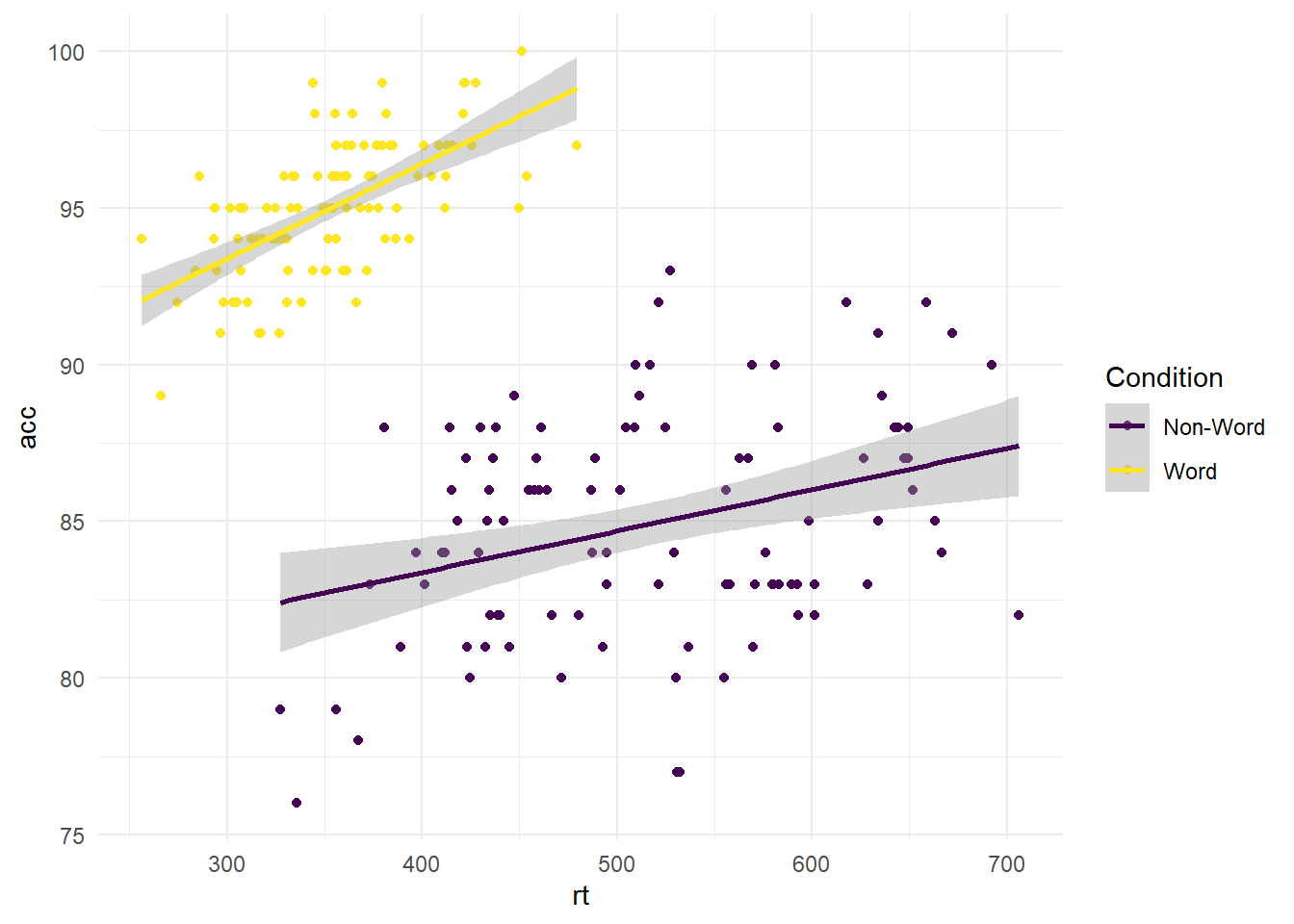
Using the viridis colour scale, you have the option between palettes A to E. For all the options, you can look at the documentation by running ?scale_colour_viridis_d in the console, or looking at this vignette online.
To play around with colours, you can choose one of the other options:
#scatterplot using dat_clean for response time by accuracy, and label by condition
ggplot(dat_clean, aes(x = rt, y = acc, colour = condition)) +
  geom_point() +
  geom_smooth(method = "lm") +
  scale_colour_viridis_d(option="A", # Which option from A to E?
                         name = "Condition", # Name for the legend title
                         labels = c("Non-Word", "Word"))+ # Names for the legend conditions
  theme_minimal()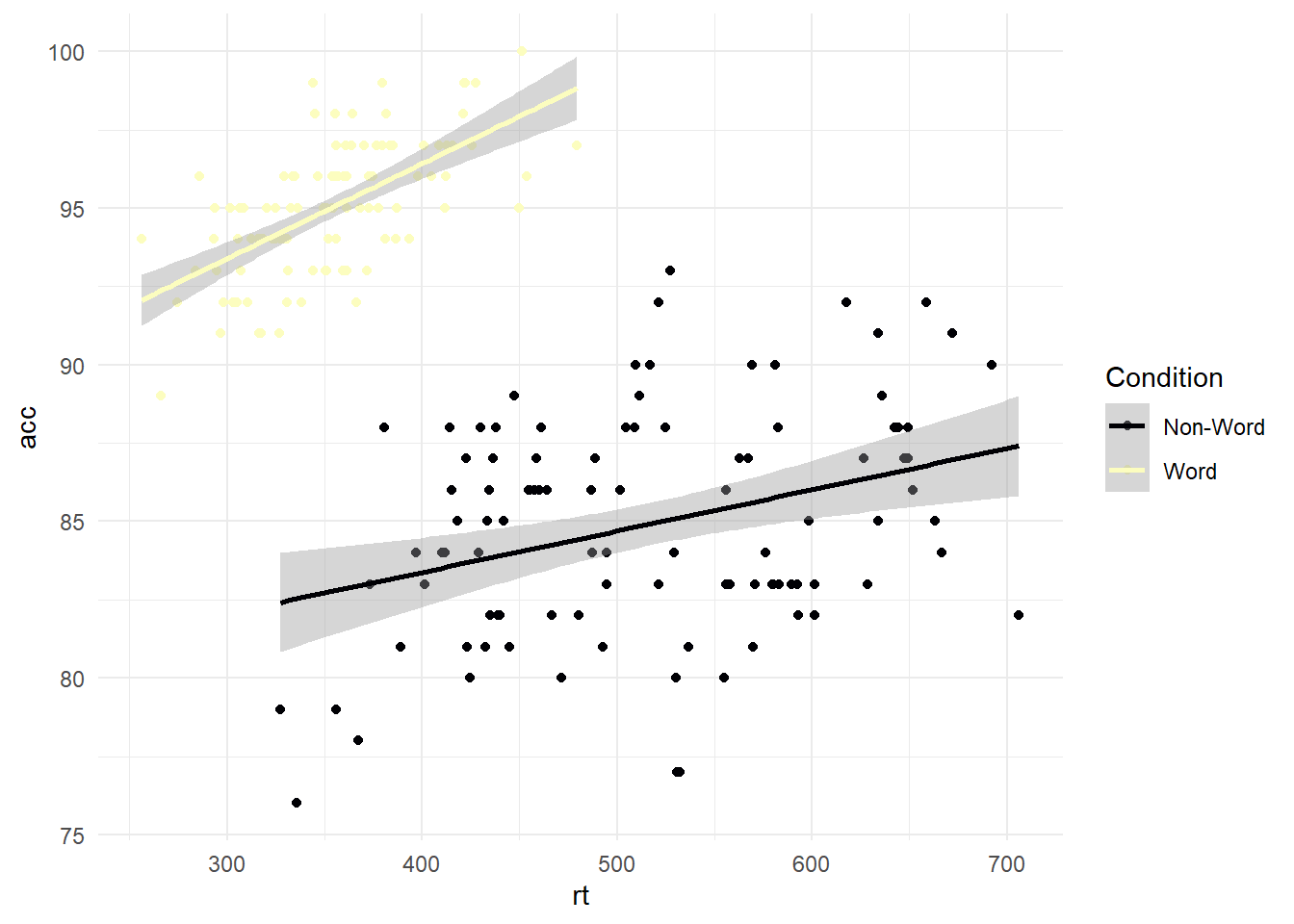
As a discrete scale, the function will add colours across the palette for the number of conditions. Alternatively, you can manually set where you have the colour map to begin and end. This provides a little more control over your colour combinations while still coming from a colour-blind friendly palette:
#scatterplot using dat_clean for response time by accuracy, and label by condition
ggplot(dat_clean, aes(x = rt, y = acc, colour = condition)) +
  geom_point() +
  geom_smooth(method = "lm") +
  scale_colour_viridis_d(option="D", # Which option from A to E?
                         begin = 0.2, # Where do you want the colour map to start?
                         end = 0.8, # Where do you want the colour map to end?
                         name = "Condition", # Name for the legend title
                         labels = c("Non-Word", "Word"))+ # Names for the legend conditions
  theme_minimal()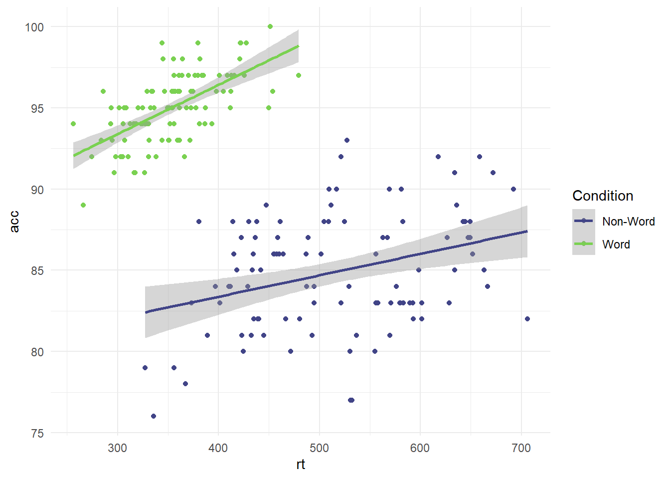
If you want full control over your colour choices (including bad choices), then you can manually select colours using HTML/CSS names or hex codes (see this online guide for names and a colour selector). For example, we can select some garish colours using specific names:
ggplot(dat_clean, aes(x = rt, y = acc, colour = condition)) +
  geom_point() +
  geom_smooth(method = "lm") +
  scale_colour_discrete(name = "Condition", # Name of the legend
                        labels = c("Non-Word", "Word"), #Name of the conditions
                        type = c("red", "cyan"))+ # here you can manually select colours for the number of conditions you have
  theme_minimal()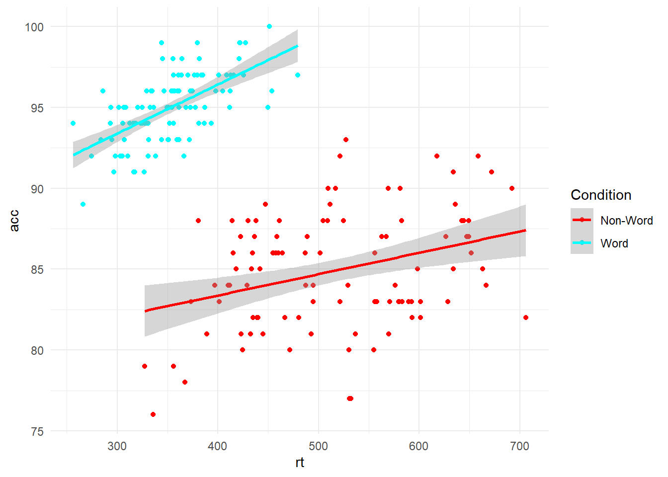
8.3 Highlight comparisons of interest
When it comes to changing the order of comparisons, it is simple to swap the variables as we just change which variable is set to x and which is set to fill:
# Condition on x, language as separate colours for the legend
ggplot(dat_clean, aes(x = condition, y= rt, fill = language)) +
  geom_boxplot() +
  labs(x = "Condition", y = "Response Time (ms)") +
  scale_fill_viridis_d(option="B",
                       begin=0.65,
                       end=0.85,
                       name = "Language") +
  scale_x_discrete(labels = c("Non-Word", "Word"))+
  theme_minimal()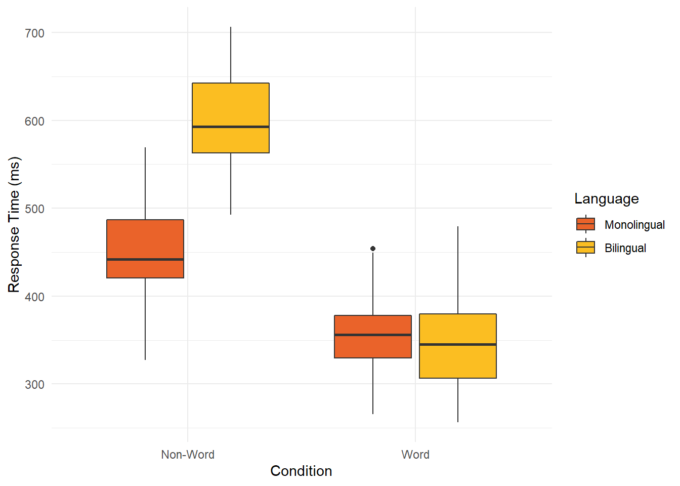
# language on x, condition as separate colours for the legend
ggplot(dat_clean, aes(x = language, y= rt, fill = condition)) +
  geom_boxplot() +
  labs(x = "Language", y = "Response Time (ms)") +
  scale_fill_viridis_d(option="B",
                       begin=0.65, end=0.85,
                       name = "Condition",
                       labels = c("Non-Word", "Word"))+
  theme_minimal()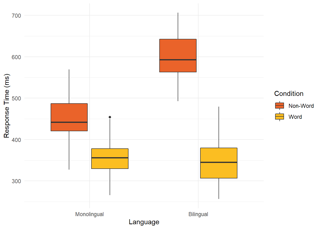
However, it can be a little tricky to switch the order of groups/conditions within a variable. For example, if you wanted Bilingual or Word presenting first, or to order the conditions from largest to smallest. We have not covered data wrangling in this workshop, so we do not expect you to know how factors work behind the scenes in R. In short, factors tell R the names are predefined discrete groups/conditions and you can provide them with an order. So, we can edit the variable we already have to switch the order. Previously, we had non-word then word since R will order things alphabetically by default.
It is really important you change the variable order first or you might mislabel the plot. If you simply switched the labels above to labels = c("Word", "Non-Word"), it would have changed the labels but not the underlying data.
In the code below, we first change the order of the factor, then run the same code as above to create the plot. We then switch the edited labels around in scale_fill_viridis_d to match our new variable order. Switching the variable order might be useful in future for highlighting comparisons of interest if you wanted to sort the groups by ascending or descending order, so people can see the pattern clearly, instead of scanning across the plot to compare distant bars etc.
# Here, we are editing a preexisting variable, so we start with the data frame and variable to save it as the same object
# On the right, we use the factor function to edit the same variable since we are editing it, not creating a new variable
# In level, this is where we set the order. By default, it was nonword and word since it will use alphabetical order
# The labels must be exactly the same as they are listed in the data or it will throw an error

dat_clean$condition <- factor(dat_clean$condition,
                              levels = c("word", "nonword"))

ggplot(dat_clean, aes(x = language, y= rt, fill = condition)) +
  geom_boxplot() +
  labs(x = "Language", y = "Response Time (ms)") +
  scale_fill_viridis_d(option="B",
                       begin=0.65, end=0.85,
                       name = "Condition",
                       labels = c("Word", "Non-word"))+ #switched around from the previous attempt
  theme_minimal()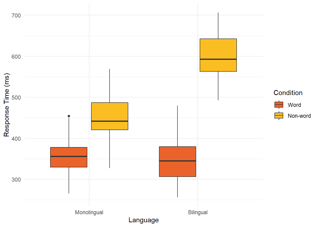
8.4 Integrate relevant text
If you want to annotate your plots, there are a few ways of doing it. Many people will create the base plot in R and then add annotations or extra design elements in additional software such as Photoshop. However, adding annotations in R with the rest of the plot means all the process is reproducible, so it is worth learning how to add even basic additions.
The first useful ggplot function is called annotate(). This is a flexible layer where you can select from different elements such as text, arrows, or shapes. See the online documentation for further examples and guidance.
We will work with the smaller version of the vaccination data we used in Chapter 1, excluding the youngest age groups. In the code below, we use the same code as the line plots in Chapter 6, but we have added an additional annotate layer to the end. For this first example, imagine we wanted to highlight a specific time period to draw people's attention to:
ggplot(vaccinations, aes(x=date, y=people_fully_vaccinated_per_hundred, colour=age_group, group=age_group))+
  geom_point()+
  geom_line()+
  theme_minimal()+
  scale_colour_viridis_d(option="D")+
  scale_x_date(date_labels = "%b %Y", # %b = abbreviated month name; %Y = Year with century
               date_breaks = "3 months") +
  labs(y = "People Fully Vaccinated Per 100", x = "Date") +
  annotate(geom = "rect", # What geom do we want? Text, arrow, rect?
           xmin = as.Date("2021-06-01"), # Start of region on X - awkward as we're working with dates
           xmax = as.Date("2021-09-01"), # End of region on X - awkward as we're working with dates
           ymin = 0, # Start of region on y
           ymax = 100, # End of region on y
           alpha = 0.5) # Make it more transparent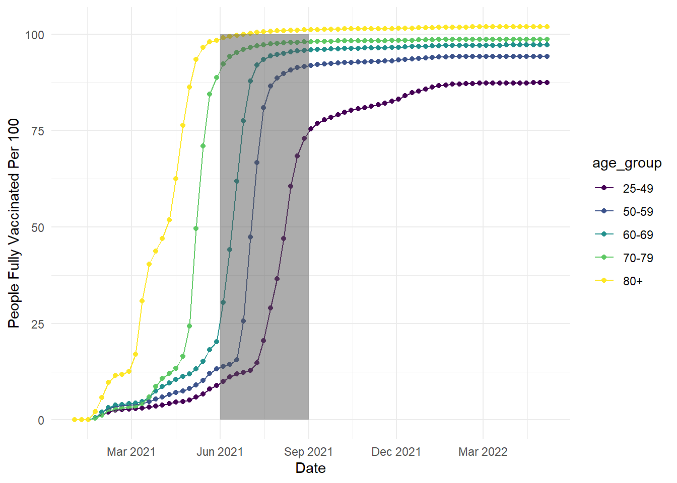
In this code, we created a semi-transparent rectangle to highlight the time period between June and September 2021. In the annotate function, you select which geom you want to create, then define its properties like the size across the x- and y-axis. Note: the x-axis is slightly awkward to work with in this example as we are working with dates, so we have to specify the x width using dates.
We can also add another layer to add text:
ggplot(vaccinations, aes(x=date, y=people_fully_vaccinated_per_hundred, colour=age_group, group=age_group))+
  geom_point()+
  geom_line()+
  theme_minimal()+
  scale_colour_viridis_d(option="D")+
  scale_x_date(date_labels = "%b %Y", # %b = abbreviated month name; %Y = Year with century
               date_breaks = "3 months") +
  labs(y = "People Fully Vaccinated Per 100", x = "Date") +
  annotate(geom = "rect", # What geom do we want? Text, arrow, rect?
           xmin = as.Date("2021-06-01"), # Start of region on X - awkward as we're working with dates
           xmax = as.Date("2021-09-01"), # End of region on X - awkward as we're working with dates
           ymin = 0, # Start of region on y
           ymax = 100, # End of region on y
           alpha = 0.5)+ # Make it more transparent
  annotate(geom = "text",
           x = as.Date("2021-12-01"),
           y = 50,
           label = "Something happened \nduring this time window...") # add \n to break to a new line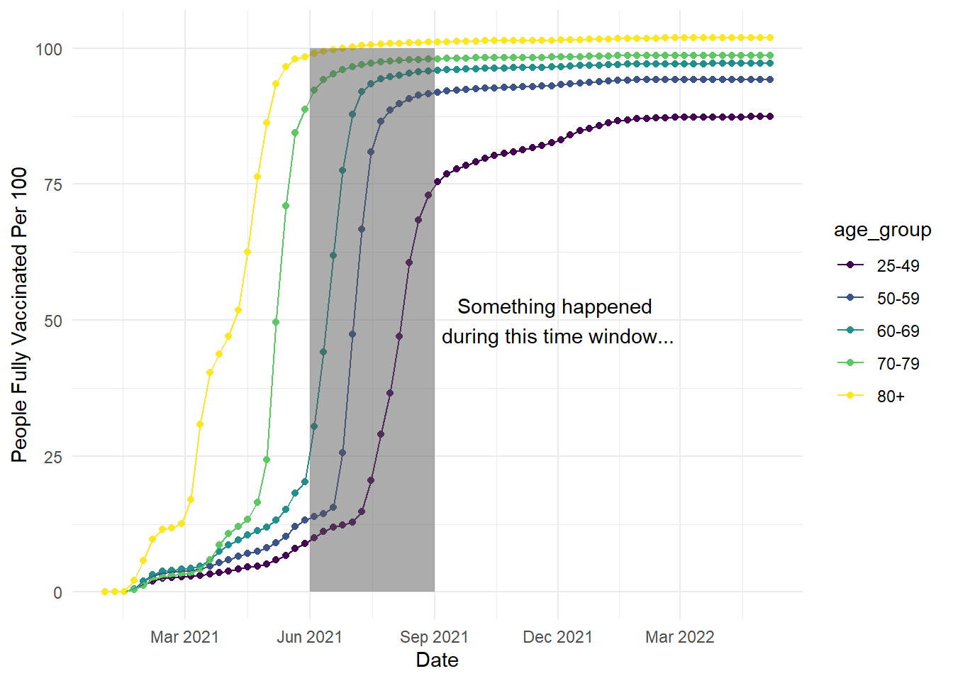
In the additional code, we added another annotate() layer but we needed slightly fewer arguments when creating text. We selected the x-axis location using a date again, then how high we wanted it on the y-axis. Do not worry if the annotations first appear in the wrong location, it can take a little trial and error to see where looks best. Since we defined a text option, we specify what we want to say with the label argument. If you want to create a line break for longer text, you can add \n to your label.
For the plot we created in Chapter 1, we used a slightly different way of creating text as it was easier to plot multiple labels and avoid overlapping. Instead of annotate(), we used geom_text() instead. The process here was more complicated and required some data wrangling, so do not worry if this makes less sense as we did not cover it in the workshop. We have added more comments than usual, so hopefully you can see what is happening when you have time to read over the materials.
# Wrangling time first - we want to create a separate little dataset so we do not have to define each element later
# 1. Create a new object from our original vaccinations dataset
# 2. Filter the dataset down to the last date, so we just have one set of age groups and final measurements
age_labels <- vaccinations %>%
  filter(date == as.Date("2022-05-06"))

# Create the exact same plot as the previous line plots
ggplot(vaccinations, aes(x=date, y=people_fully_vaccinated_per_hundred, colour=age_group, group=age_group))+
  geom_point()+
  geom_line()+
  theme_minimal()+
  theme(legend.position = "none") +
  scale_colour_viridis_d(option="D")+
  scale_x_date(date_labels = "%b %Y", # %b = abbreviated month name; %Y = Year with century
               date_breaks = "3 months") +
  labs(y = "People Fully Vaccinated Per 100", x = "Date") +
  geom_text(data = age_labels, # Take our new smaller dataset
            aes(x = as.Date("2022-05-25"), #Slightly later date, so it does not overlap with the line
                y = people_fully_vaccinated_per_hundred, # Unique value of y for each age group
                label = age_group), # Unique label for each age group
check_overlap = TRUE) # Argument that prevents text overlapping 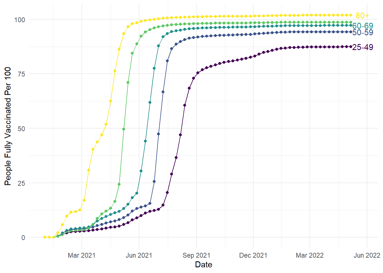
To provide a little more explanation to the new geom_text() layer, we can use it like previous geom layers like geom_line. We can use a different data source as the main plot by defining a data frame to use. We can then use aesthetic elements to control how we plot the data.
To be more efficient, the wrangling at the start took the original data frame and limited it to the final date. This meant we could take the labels and y-axis heights to help us plot the labels without individually defining each age group. We selected a date slightly later than the final measurement so the text did not overlap with the lines. We used the vaccination rate to create unique values for y level with each line. Finally, we used the age group column to add the label to each line. This geom takes previous customisation options, so we have the added bonus here of matching the colour scheme. If you wanted to override the previous colour scheme, you would define the colour outside the aes argument:
# Create the exact same plot as the previous line plots
ggplot(vaccinations, aes(x=date, y=people_fully_vaccinated_per_hundred, colour=age_group, group=age_group))+
  geom_point()+
  geom_line()+
  theme_minimal()+
  theme(legend.position = "none") +
  scale_colour_viridis_d(option="D")+
  scale_x_date(date_labels = "%b %Y", # %b = abbreviated month name; %Y = Year with century
               date_breaks = "3 months") +
  labs(y = "People Fully Vaccinated Per 100", x = "Date") +
  geom_text(data = age_labels, # Take our new smaller dataset
            aes(x = as.Date("2022-05-25"), #Slightly later date, so it does not overlap with the line
                y = people_fully_vaccinated_per_hundred, # Unique value of y for each age group
                label = age_group), # Unique label for each age group
            check_overlap = TRUE, # Argument that prevents text overlapping
            colour = "black") # Manually set the colour outside aes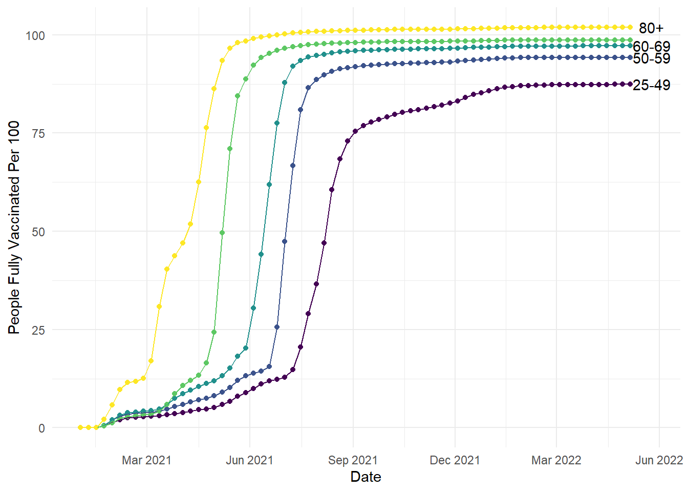
8.5 Guide viewers to your conceptual message
For this section in Chapter 1, our main message was to respect common associations such as more positive means higher values. It can be deeply confusing to people - particularly those with less subject experience - to go against these associations. The example we used was from example EEG data where, historically, amplitude measured in micro Volts was plotted with negative at the top and positive at the bottom. In ggplot, we would have to intervene to flip the y-axis. For a starting point, lets see what the plot looks like normally (and we would argue most logically):
# Create a line plot for time series, grouping by condition to join the lines
ggplot(impulsivity_long, aes(x=Time_point, y=mean_mV, colour=Condition, group=Condition))+
  geom_point()+
  geom_line()+
  theme_minimal()+
  scale_colour_viridis_d(option="D", begin = 0.5, end = 0.8)+
  scale_x_continuous(breaks = seq(0, 1000, 200))+
  labs(y = "Amplitude (\u00B5V)", x = "Time (ms)") # UTC code \u00B5 creates the mu symbol for micro Volts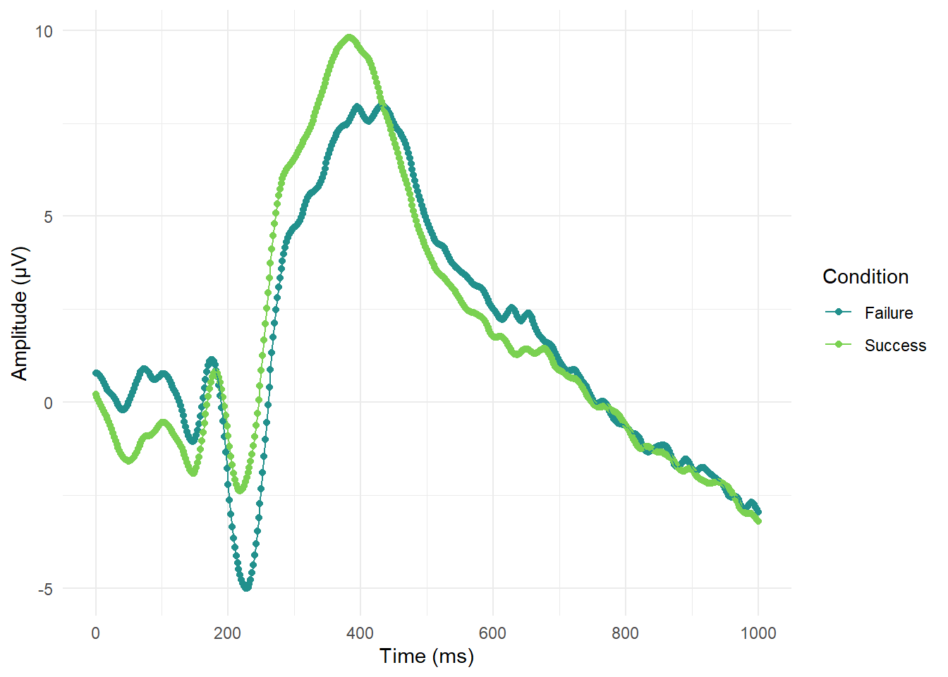
So far so good and it is pretty clear where there are waves moving in a negative or positive direction. If we wanted to flip the y-axis to make it look closer to old school EEG plots, then we only need one additional layer:
ggplot(impulsivity_long, aes(x=Time_point, y=mean_mV, colour=Condition, group=Condition))+
  geom_point()+
  geom_line()+
  theme_minimal()+
  scale_colour_viridis_d(option="D", begin = 0.5, end = 0.8)+
  scale_x_continuous(breaks = seq(0, 1000, 200))+
  labs(y = "Amplitude (\u00B5V)", x = "Time (ms)") + # UTC code \u00B5 creates the mu symbol for micro Volts
  scale_y_reverse()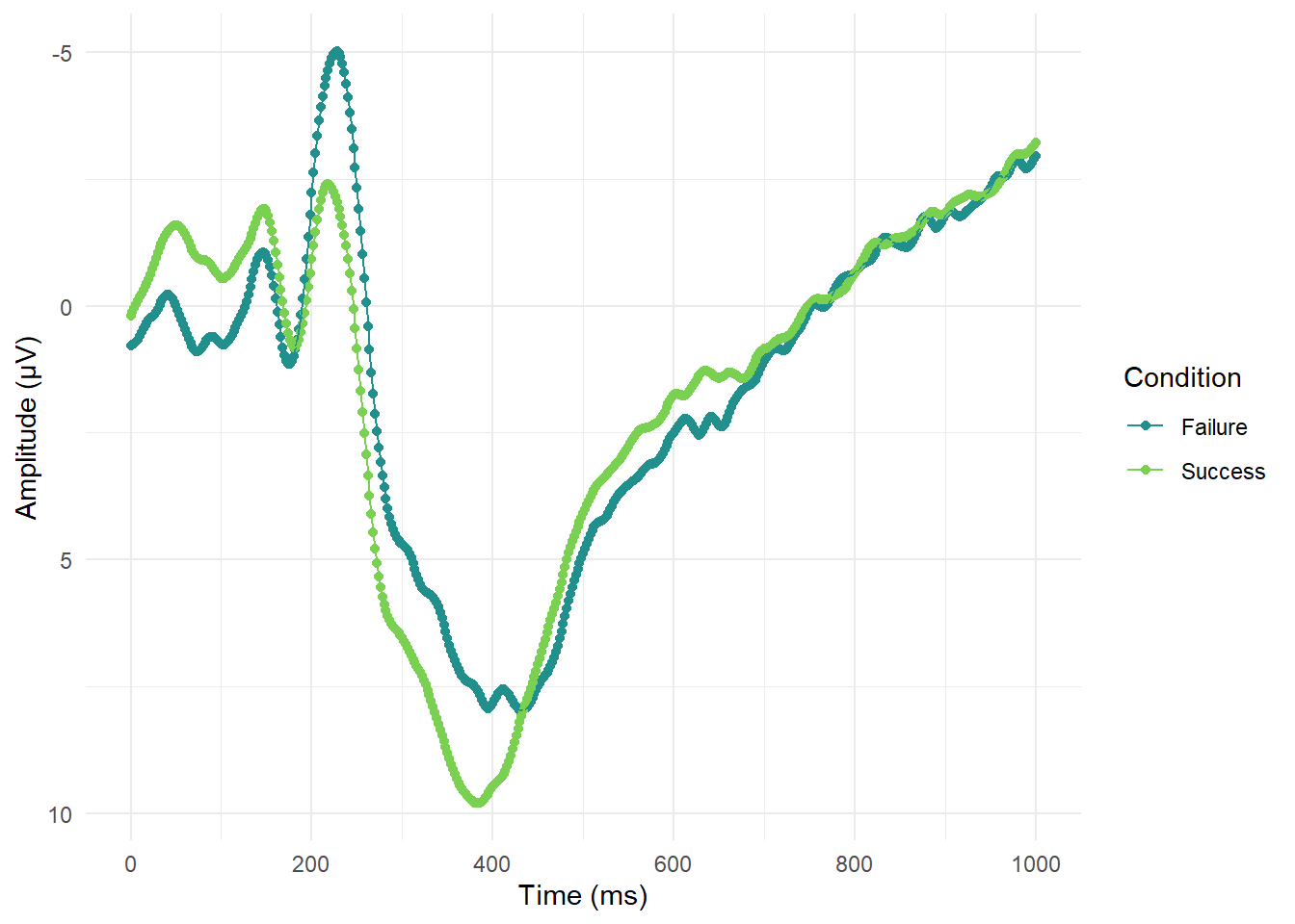
Sometimes ggplot can be a little cryptic, but this additional layer is pretty self-explanatory. The geom is called scale_y_reverse() and does what it says on the tin.
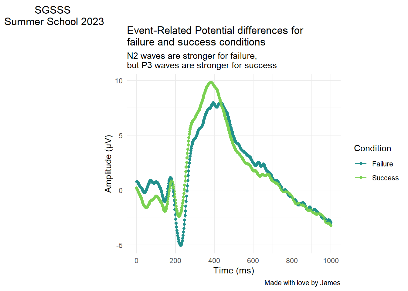
8.6 Adding titles and subtitles
As a final bonus section, you can add titles, subtitles, captions, and tags within ggplot. If you are inserting the plot into a report, its normally easier to add figure captions in the software you are using. However, if you create a standalone plot, you might want to add a title for context or add your name as the creator for the caption.
We have used it in previous plots to change the x and y axis names, but there is a layer called labs() where you can define any label on the plot. Here are some additional options you can add if you ever need them:
ggplot(impulsivity_long, aes(x=Time_point, y=mean_mV, colour=Condition, group=Condition))+
  geom_point()+
  geom_line()+
  theme_minimal()+
  scale_colour_viridis_d(option="D", begin = 0.5, end = 0.8)+
  scale_x_continuous(breaks = seq(0, 1000, 200))+
  labs(y = "Amplitude (\u00B5V)", x = "Time (ms)") + # UTC code \u00B5 creates the mu symbol for micro Volts
  labs(title = "Event-Related Potential differences for \nfailure and success conditions", # Big title at the top
       subtitle = "N2 waves are stronger for failure, \nbut P3 waves are stronger for success", # Little subtitle at the top
       caption = "Made with love by James", # Smaller caption bottom right
       tag = "SGSSS \nSummer School 2023") # Large tag top left