4 Scatterplots
Correlation data are typically visualised with a scatterplot. Scatterplots are created by calling geom_point() and require both an x and y variable to be specified in the mapping.
ggplot(dat_clean, aes(x = rt, y = acc)) +
  geom_point()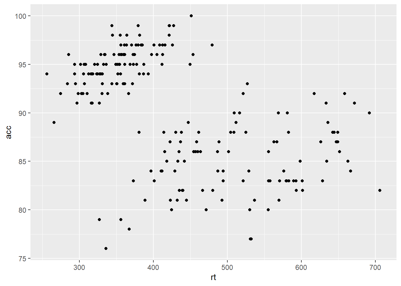
Figure 4.1: Scatterplot of reaction time versus accuracy.
A line of best fit can be added with an additional layer that calls the function geom_smooth(). The default is to draw a LOESS (locally estimated scatterplot smoothing) or curved regression line. However, a linear line of best fit can be specified using method = "lm". By default, geom_smooth() will also draw a confidence envelope around the regression line; this can be removed by adding se = FALSE to geom_smooth(). A common error is to try and use geom_line() to draw the line of best fit, which whilst a sensible guess, will not work.
ggplot(dat_clean, aes(x = rt, y = acc)) +
  geom_point() +
  geom_smooth(method = "lm")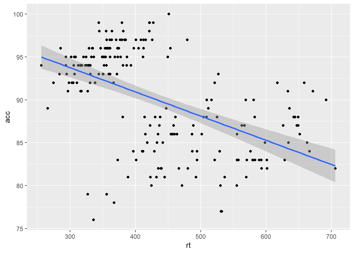
Figure 4.2: Line of best fit for reaction time versus accuracy.
4.1 Grouped scatterplots
R will always follow your instructions, even when your instructions might not be the best option for your data. This is where you as the analyst comes in to make decisions on how best to visualise the data and highlight patterns. You might notice in the scatterplot above the single regression line is negative, but there are roughly two groups of data which look positive. This is an example of something called Simpson's paradox (see, Kievit et al., 2013) where associations for a whole population may be reserved for different sub-groups.
To highlight different groups and potentially uncover these patterns, scatterplots can be easily adjusted to display grouped data. For geom_point(), the grouping variable is mapped to colour rather than fill:
ggplot(dat_clean, aes(x = rt, y = acc, colour = condition)) +
  geom_point() +
  geom_smooth(method = "lm")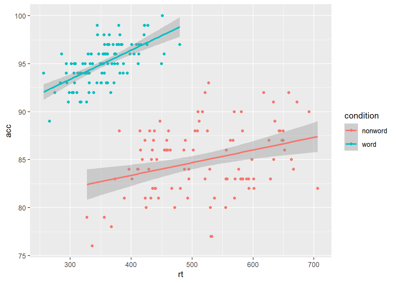
Figure 4.3: Grouped scatterplot of reaction time versus accuracy by condition.
4.2 Facets
So far we have produced single plots that display all the desired variables. However, there are situations in which it may be useful to create separate plots for each level of a variable. This can also help with accessibility when used instead of or in addition to group colours.
Rather than using
colour = conditionto produce different colours for each level ofcondition, this variable is instead passed tofacet_wrap().Set the number of rows with
nrowor the number of columns withncol. If you don't specify this,facet_wrap()will make a best guess.
ggplot(dat_clean, aes(x = rt, y = acc)) +
  geom_point() +
  geom_smooth(method = "lm") +
  facet_wrap(~condition, nrow = 2)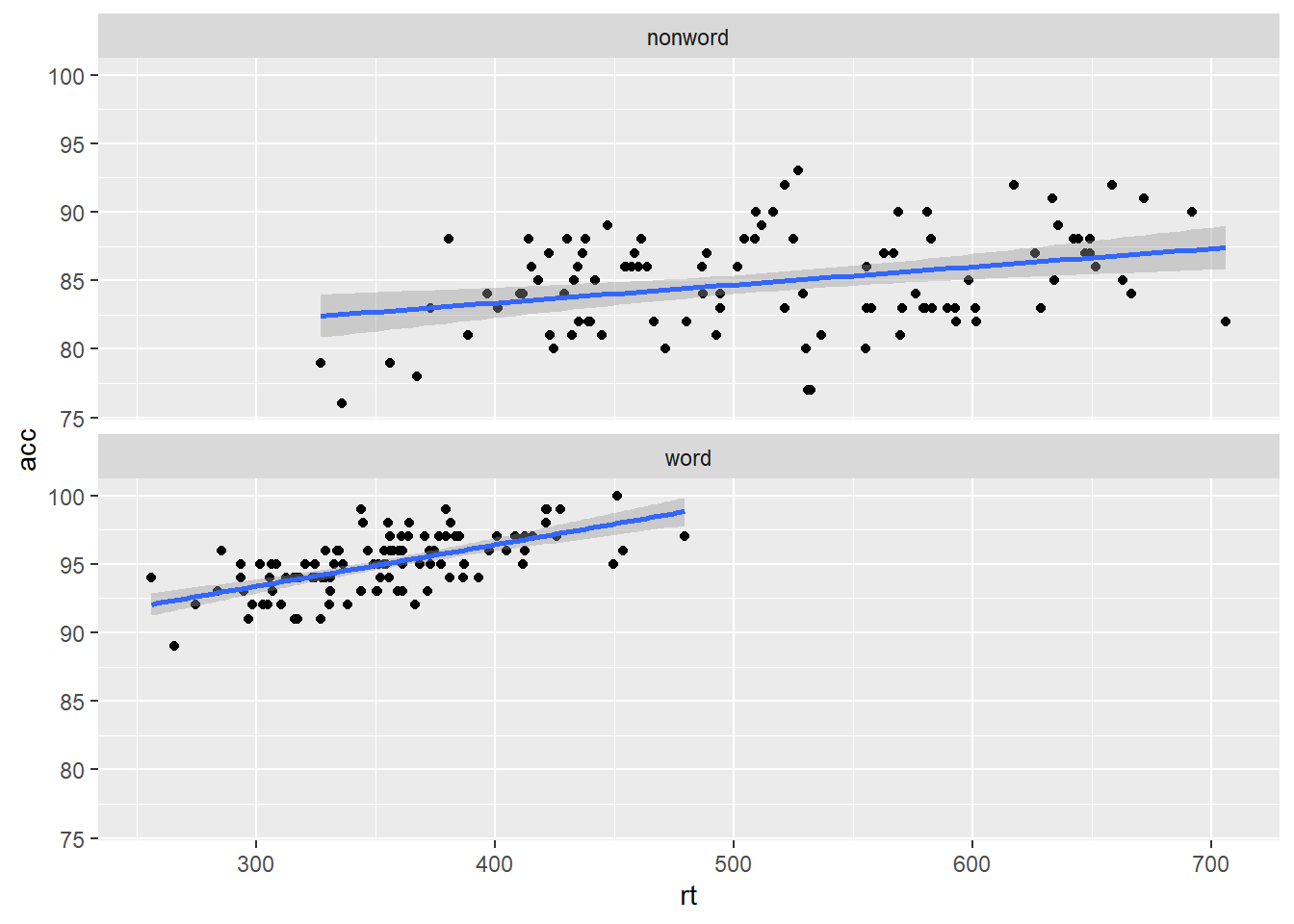
Figure 4.4: Faceted scatterplot
4.3 Customisation 2
4.3.1 Editing axis names and labels
To edit axis names and labels you can connect scale_* functions to your plot with + to add layers. These functions are part of ggplot2 and the one you use depends on which aesthetic you wish to edit (e.g., x-axis, y-axis, fill, colour) as well as the type of data it represents (discrete, continuous).
For the bar chart of counts, the x-axis is mapped to a discrete (categorical) variable whilst the y-axis is continuous. For each of these there is a relevant scale function with various elements that can be customised. Each axis then has its own function added as a layer to the basic plot.
ggplot(dat_clean, aes(x = rt, y = acc)) +
geom_point() +
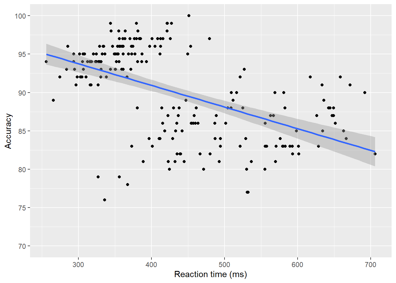
geom_smooth(method = "lm")+
scale_x_continuous(name = "Reaction time (ms)") +
scale_y_continuous(breaks = c(0,10,20,30,40,50,60,70,80,90,100), limits= c(0, 100))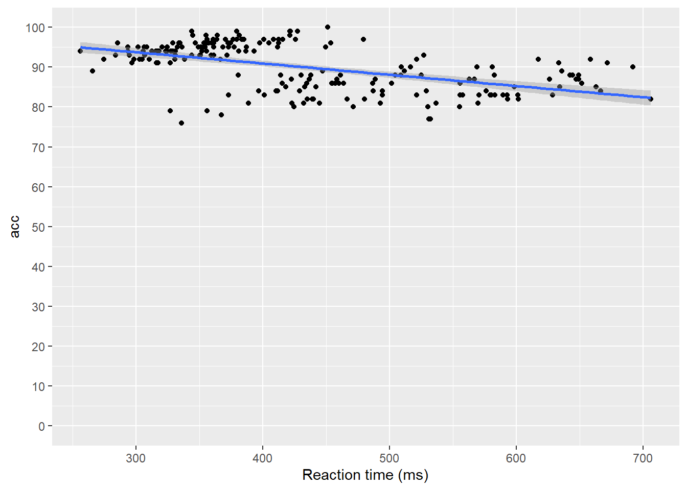
Figure 4.5: Scatterplot with custom axis labels.
namecontrols the overall name of the axis (note the use of quotation marks).breakscontrols the tick marks on the axis. Again, because there are multiple values, they are enclosed withinc(). Because they are numeric and not text, they do not need quotation marks.c()is a function that you will see in many different contexts and is used to combine multiple values. In this case, the breaks we want to apply are combined withinc().limitscontrols the start and end of the axis. ggplot2 will try and guess a good range for the data, but sometimes we also need to set thelimits()of our axis for thebreaksto work. If you delete thelimitsargument above, you will see that despite setting breaks from 0, the axis tick marks will start from 80 as the smallest value is approximately 75.
4.3.2 Specifying axis breaks with seq()
Typing out all the values we want to display on the axis is sometimes inefficient. Instead, we can use the function seq() to specify the first and last value and the increments by which the breaks should display between these two values.
ggplot(dat_clean, aes(x = rt, y = acc)) +
  geom_point() +
  geom_smooth(method = "lm")+
  scale_x_continuous(name = "Reaction time (ms)") +
  scale_y_continuous(name = "Accuracy", breaks = seq(70, 100, by=5), limits= c(70,100))