6 Line plots
In this final data visualisation chapter, we will show one option for visualisation of time series data: line plots. There are many other ways of visualising data like this, such as heatmaps: https://r-graph-gallery.com/283-the-hourly-heatmap.html, or stacked area charts: https://r-graph-gallery.com/136-stacked-area-chart, which you will be able to create with ggplot2 as well.
For this chapter, instead of the simulated dataset, we will use a real dataset on covid-19 vaccinations in Denmark from Our World in Data (https://ourworldindata.org/). We have cleaned the data for the purposes of this workshop and it can be downloaded from our workshop OSF page.
Make sure you download the data file and paste it into your project folder before trying to run the code below.
6.1 Read in the data
The code below will create a new object vaccinations and read in the datafile vaccinations_by_age_group.csv:
vaccinations <- read_csv("vaccinations_by_age_group.csv")In this data set, we have vaccination data from Denmark for different age groups.
datecolumn shows the timestamps. This will be the x axis of your plot.people_fully_vaccinated_per_hundredshows the data on how many people per hundred have been vaccinated on a given date (the data are cumulative).
-age_group shows the age data split by age (15-17, 18-24, 25-49, 50-59, 60-69, 70-79, 80+).
6.2 Line plot
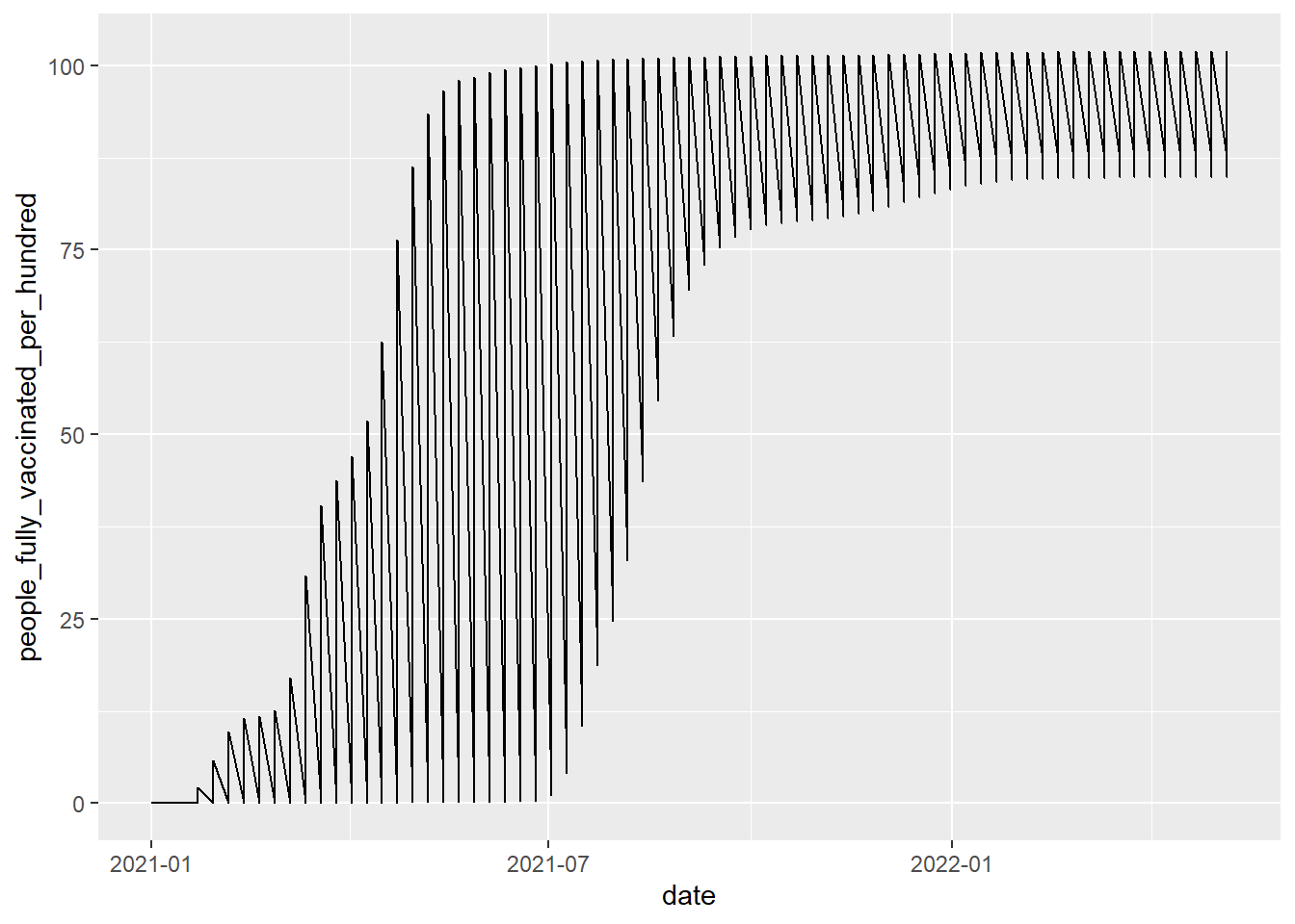
Let's start by making a simple line plot. For a line plot, you need to define the x and the y axes in your aes() function.
6.2.1 Grouping the plot
Unless you enjoy recreating album covers from the Arctic Monkeys, you can see that this plot doesn't make any sense. That's because there are multiple data points for each of the dates (each of the age groups have their own entry). To make a plot that makes sense, we need to group the plot by age group. This means that the ggplot function will split the data based on the variable you specify in the group argument.
ggplot(vaccinations, aes(x = date, y = people_fully_vaccinated_per_hundred, group=age_group))+
  geom_line()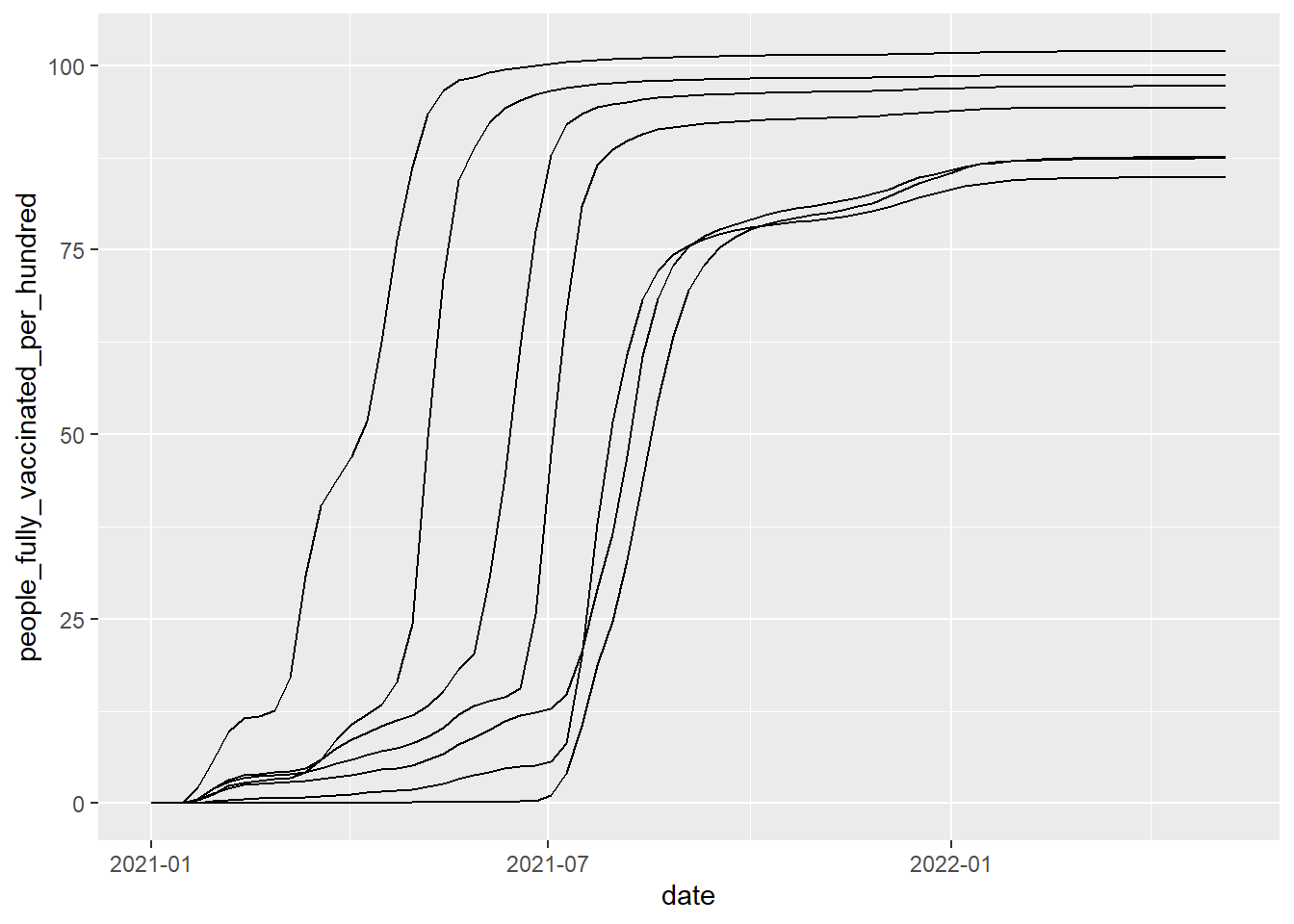
Alternatively, you could facet the plot, but then you won't be able to see the trends in one plot, which is usually important for time series data.
ggplot(vaccinations, aes(date, people_fully_vaccinated_per_hundred))+
  geom_line()+
  facet_wrap(~age_group)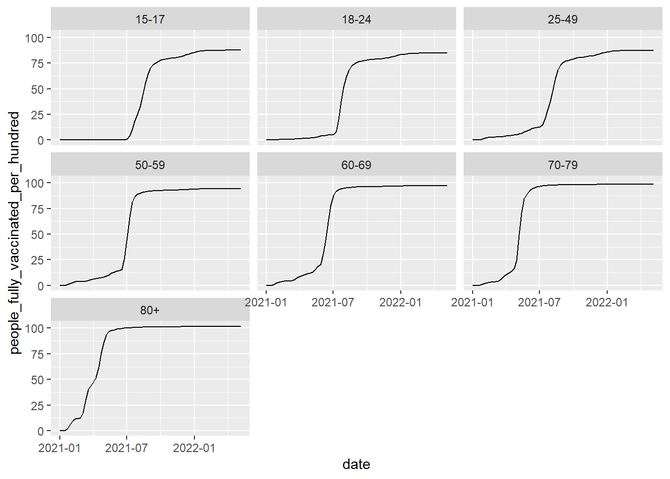
6.2.2 Customising the plot
Finally, we'll add colour to the plot to distinguish the age groups, and we'll add another layer with geom_point() to mark the different time points more clearly, we'll change the theme of the plot and make it colour-blind friendly.
ggplot(vaccinations, aes(x=date, y=people_fully_vaccinated_per_hundred, colour=age_group, group=age_group))+
geom_point()+
geom_line()+
theme_minimal()+
scale_colour_viridis_d(option="D")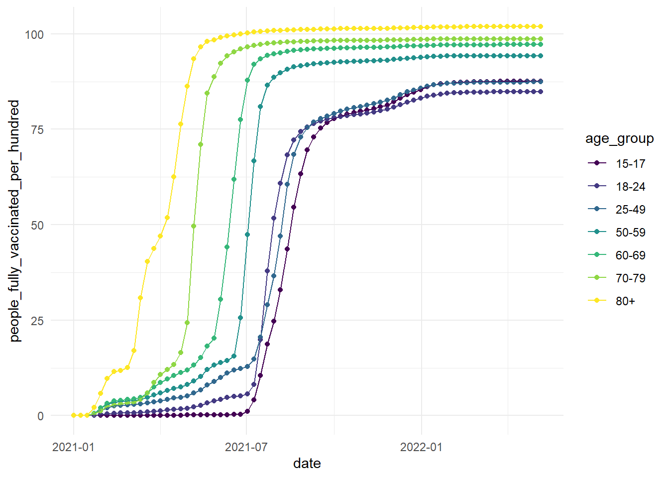
6.2.3 Dealing with a date axis
One thing to note is that the x-axis here is with dates instead of numbers (if you look at the vaccinations dataframe, the datatype is unknown. Luckily, there are customisation options for this on ggplot! We can use the scale_x_date function as a layer to modify and work with date formats:
ggplot(vaccinations, aes(x=date, y=people_fully_vaccinated_per_hundred, colour=age_group, group=age_group))+
  geom_point()+
  geom_line()+
  theme_minimal()+
  scale_colour_viridis_d(option="D")+
  scale_x_date(date_labels = "%b %Y", # %b = abbreviated month name; %Y = Year with century
               date_breaks = "3 months")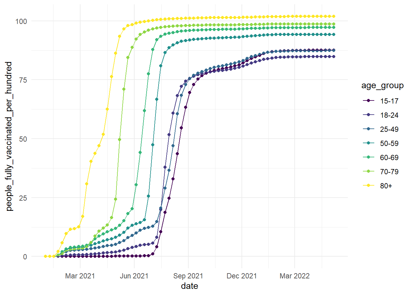
If you want more information on customising dates in ggplot, this blog post is very useful: https://www.r-bloggers.com/2018/06/customizing-time-and-date-scales-in-ggplot2/
6.3 End of first half!
Well done for completing the first half of the workshop! Now you should have a basic understanding of how ggplot2 works, the different plot types, and customisation options available to you. There are further resources in appendix A if you would like to expand your plotting skills.
For the second half of the workshop, we will do a small data visualisation group project, which you can find in chapter 7!